Pattern Library-USTAR studio
The styleguide is a resource for designers, product managers, and developers, providing a common language around the USTAR studio UI patterns.
The styleguide is a resource for designers, product managers, and developers, providing a common language around the USTAR studio UI patterns.
The Font used in the body is Nunito Sans, all the font color starts at #222222
 h1, h2, h3, h4, h5, h6 {
  margin-top: 0;
  margin-bottom: 2rem;
  font-weight: 300; }
h1 { font-size: 4.0rem; line-height: 1.2;}
h2 { font-size: 3.6rem; line-height: 1.25;  }
h3 { font-size: 3.0rem; line-height: 1.3;   }
h4 { font-size: 2.4rem; line-height: 1.35;  }
h5 { font-size: 1.8rem; line-height: 1.5;  }
h6 { font-size: 1.5rem; line-height: 1.6;   }

@media (min-width: 550px) {
  h1 { font-size: 4.0rem; }
  h2 { font-size: 3.6rem; }
  h3 { font-size: 3.2rem; }
  h4 { font-size: 2.6rem; }
  h5 { font-size: 2.2rem; }
  h6 { font-size: 1.6rem; }
} Doc Background
With #222222 text
#F2F2F2
rgba(248, 250, 251,1);
Indigo
With #ffffff text
#194164
rgba(25,65,100,1);
Agua Azul
With #ffffff text
#235EBA
rgba(35, 94, 186,1);
Cielito Lindo
With #222222 text
#4EACE0
rgba(78, 172, 224,1);
Green Grillo
With #222222 text
#14C673
rgba(20, 198, 115,1);
Sun Yellow
With #222222 text
#FFCC4F
rgba(255, 204, 79,1);
These will have images on top the button is the background and the image will change when active, innactive or passive (grayed out)
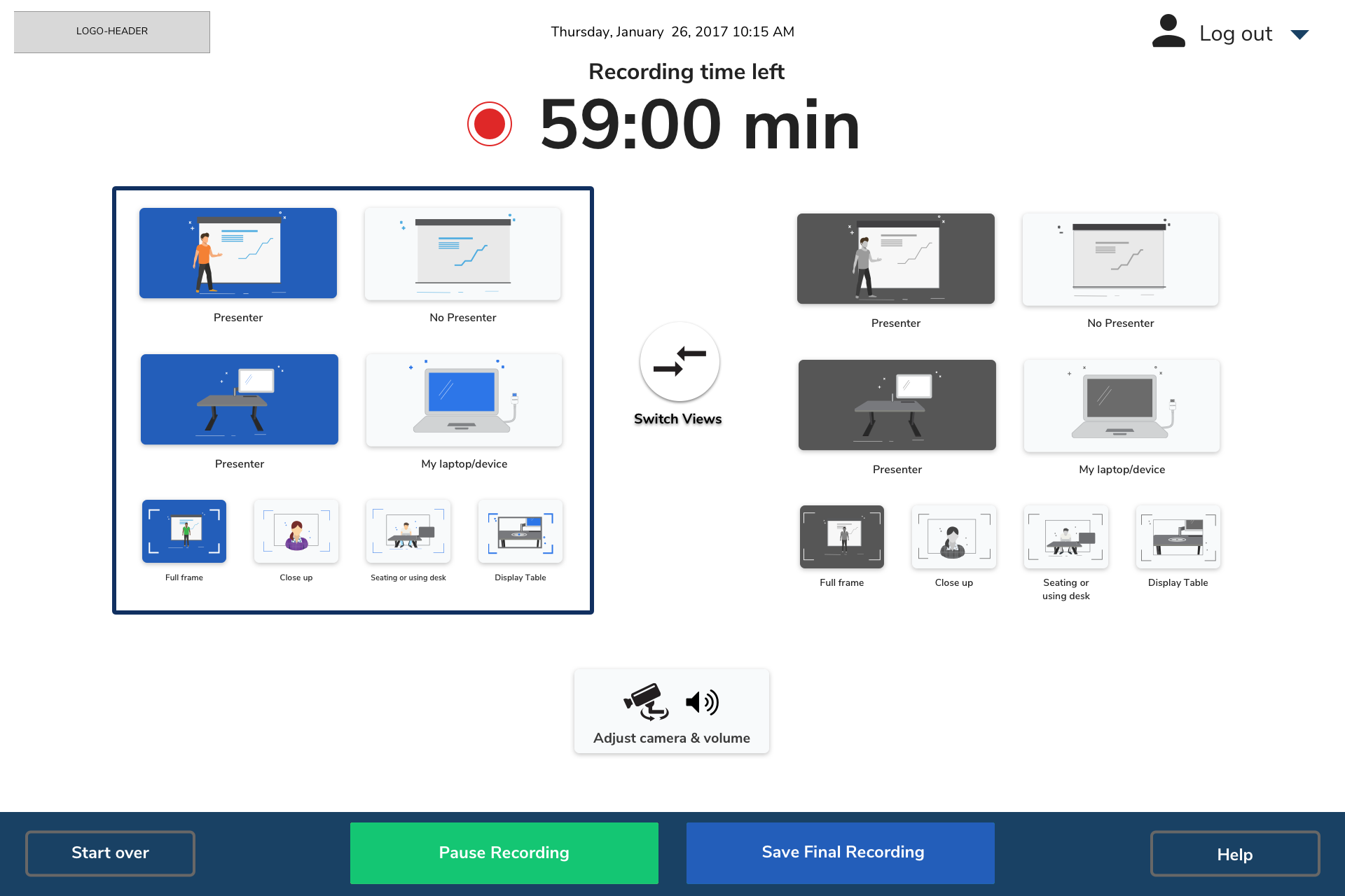
When user presses pause it will flash to indicate that the recording is being pasued it can resume by pressing pause again
go from button-2 to button-2: active animation time can be determined by developer
.button-text{
text-align: center;
vertical-align: middle;
line-height: 67px; }

.button-1 {
  width: 100%;
  height: 67px;
  padding: 1px;
  color: #ffffff;
  border-radius: 3px;
  background-color: #235eba;}

.button-1:active {
  background-color: #174381;}

.button-2{
  width: 100%;
  height: 67px;
  padding: 1px;
  border-radius: 3px;
  background-color: #14c673;}

.button-2:active {
  background-color: #109e5b;}

.button-3 {
  width: 100%;
  height: 67px;
  padding: 1px;
  border-radius: 3px;
  background-color: #4eace0;}

.button-3:hover {
  border: 2px solid #72bce6;
  background-color: #4eace0;}

.button-3:active {
  background-color: #3e8ab4;}

.button-4 {
  width: 100%;
  height: 67px;
  padding: 1px;
  border-radius: 3px;
  background-color: #ffcc4f;}

.button-4:active {
  background-color: #e5b847;}

.button-footer {
  width: 235px;
  height: 59px;
  padding: 1px;
  border: 4px solid #676767;
  border-radius: 3px;
  background-color: #194164;
  color: #ffffff; }

.button-text-footer{
  text-align: center;
vertical-align: middle;
line-height: 59px; }

.disable-button {
  width: 100%;
  height: 67px;
  padding: 1px;
  border-radius: 3px;
  background-color: #c7c7c9;}

.disable-button-text {
  text-align: center;
vertical-align: middle;
line-height: 67px;
  text-shadow: 0 2px 0 rgba(244, 241, 234, 0.9);
  font-size: 1em;
  text-align: center;
  color: #9e9da2;}

.button-1:hover,
.button-2:hover,
.button-4:hover,
.element-7:hover {
  border: 2px solid #4eace0;}

.button-footer:active {
  background-color: #ffffff;
  color: #194164;}

.setup-button {
  width: 595px;
  height: 272px;
  border-radius: 5px;
  border-radius: 5px;
  background-color: #ffffff;
  box-shadow: 0 2px 7px rgba(0, 0, 0, .5);}

.setup-button:active {
  background-color: #235eba;
box-shadow: 0 2px 7px rgba(0, 0, 0, .5);} Here is an example of animation https://github.com/tonystar/float-label-css
Input field:
box-shadow: 0 1px 0 0 rgba(0,0,0,0.50);

Input text:
font-family: NunitoSans-Light;
color: #4A4A4A;See the Pen Volume Slider by Emil Carlsson (@emilcarlsson) on CodePen.
Black background:
  backgroung-color:rgba(34, 34, 34, .7)
Content background: #f4f1ea
All graphics centered

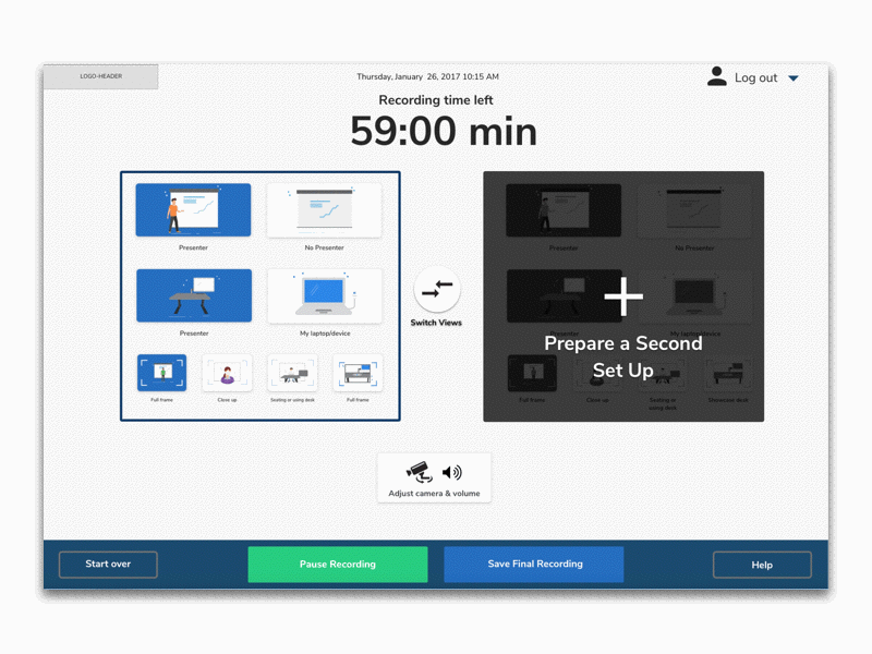
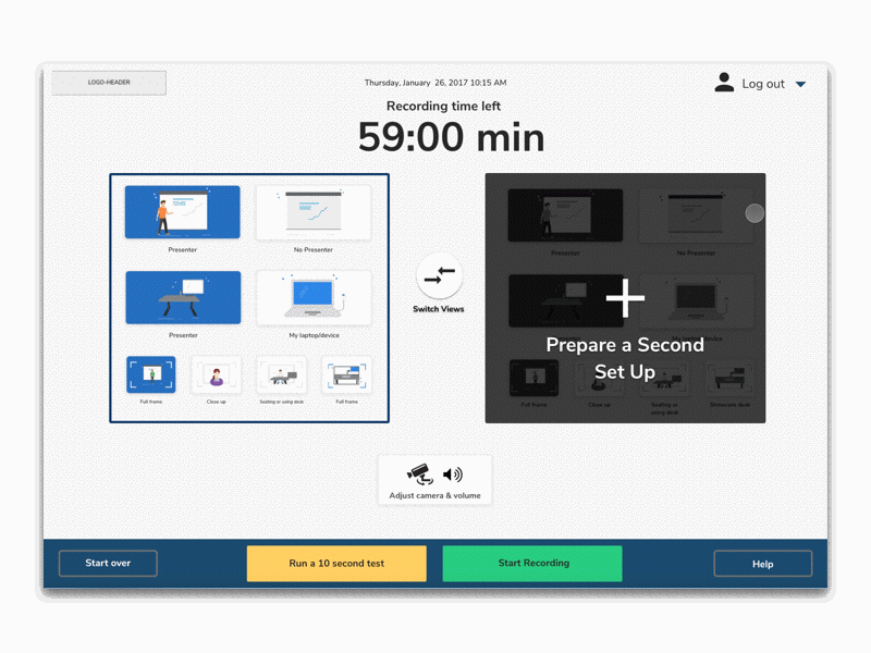
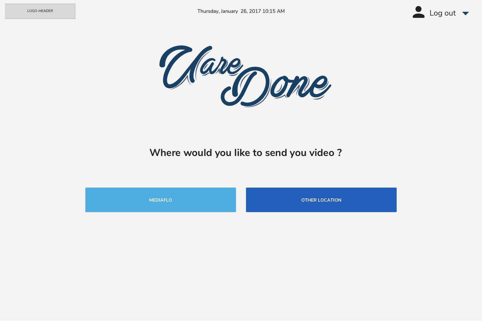
NOTE: when clicking on -start over- here was only to show the 2 possible outcomes this is not expected behaviour of star over
I found this in case you do not have a player UI but it does not have to be this one. Pleae put the play button to the center of the player like in example above this is an example and here is the actual source http://videojs.com/
See the Pen Video.js Default Skin by ferba (@ferba) on CodePen.
This one would be my preference and option #1
See the Pen Movie Style Film Countdown by ferba (@ferba) on CodePen.
Incase this is not liekd here is an option #2 more simple, I would just using our font Nunito Sans
See the Pen Puff the Magic Countdown (CSS3) by ferba (@ferba) on CodePen.

Background image/ color may change and button colors may change
For input box desire animation please refer to old CSS document, look for: .input__label--yoshiko
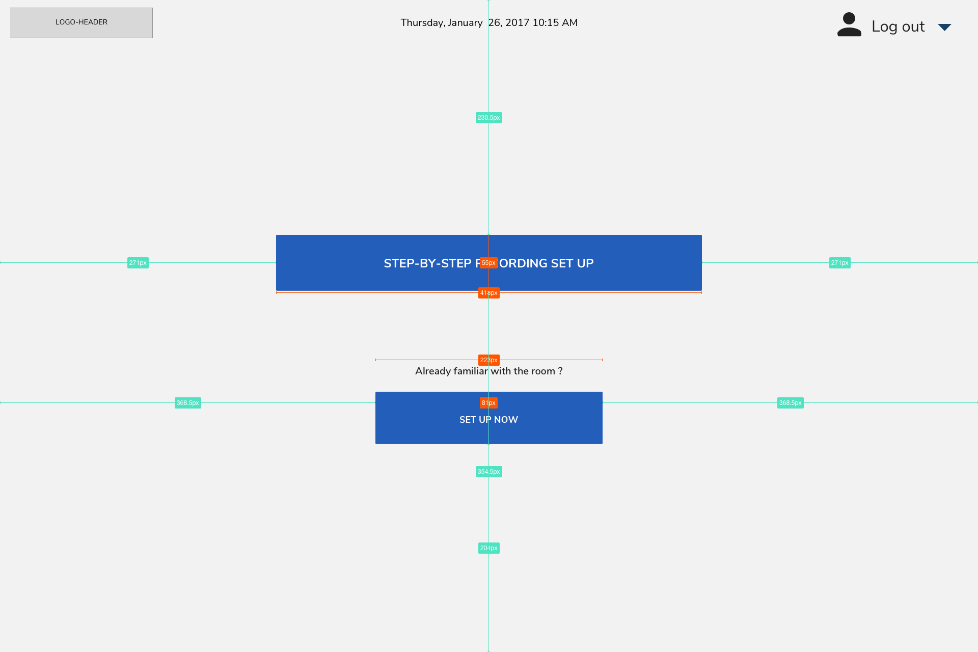
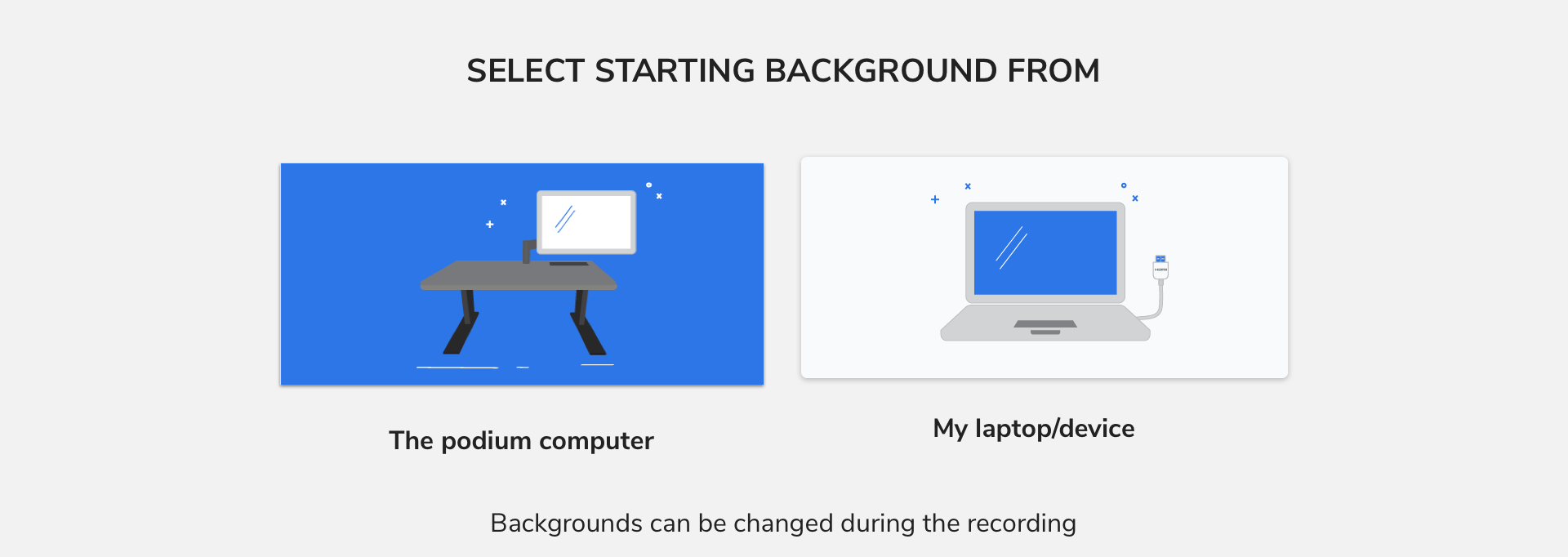
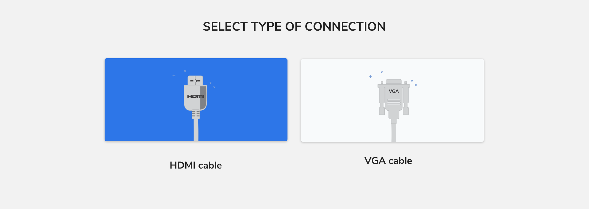
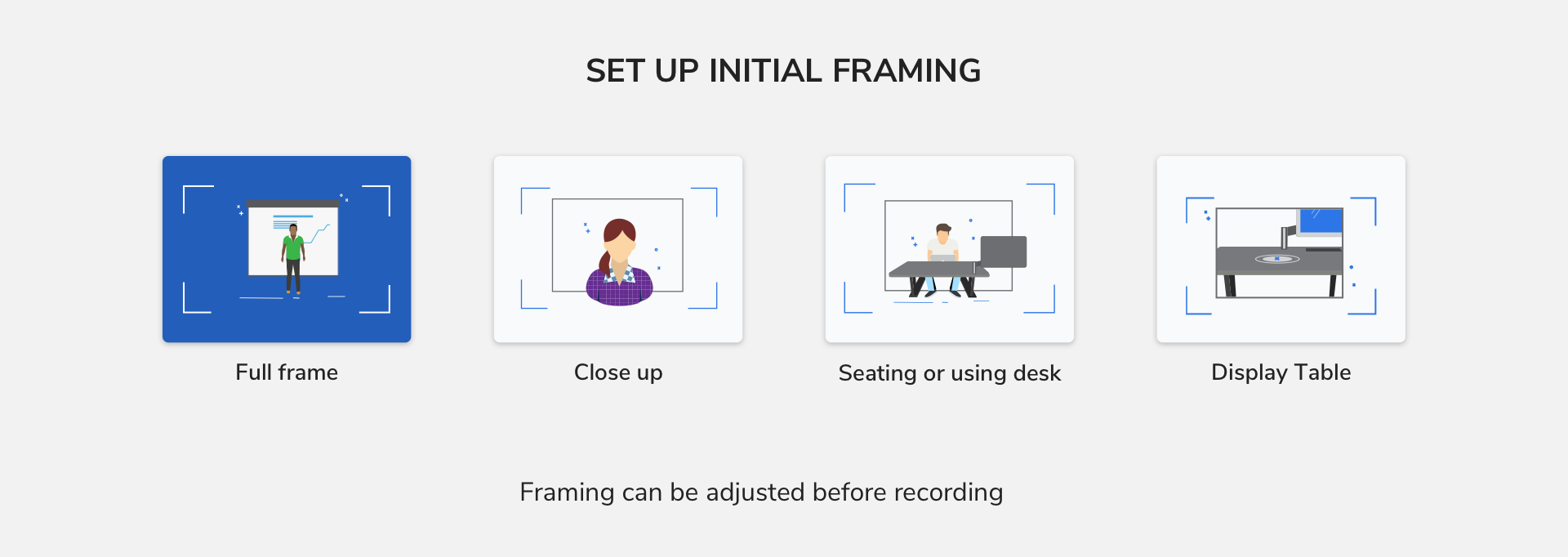
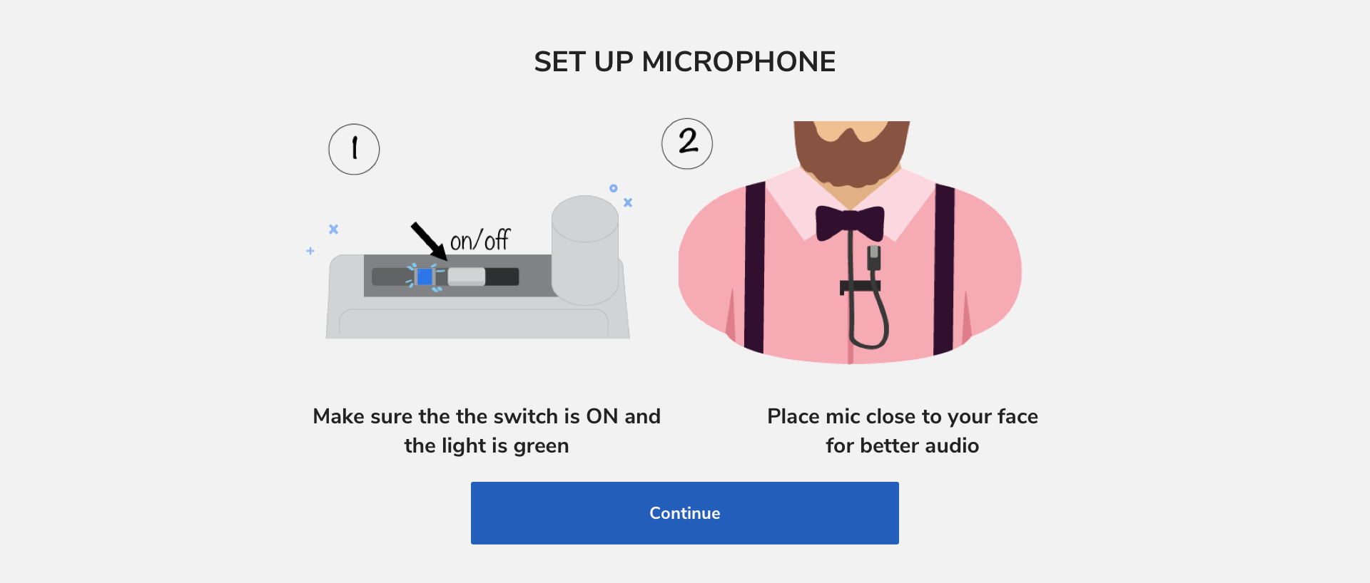
For the set up pages the layout is the same what changes is the copy for the subtitle and the icons that go in the .startup-buttons
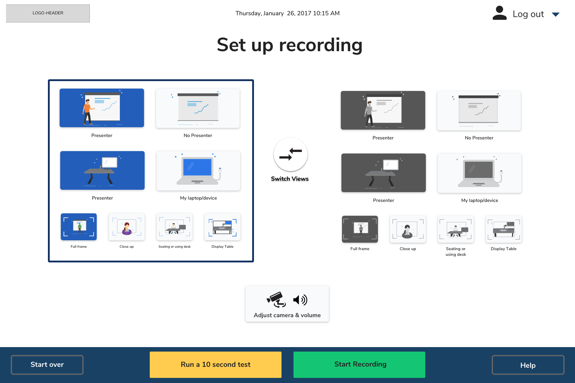
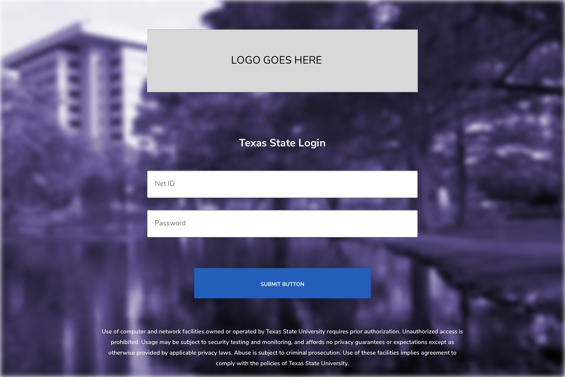
located in Header in all pages

Download all assetes from the logout-graphics.zip
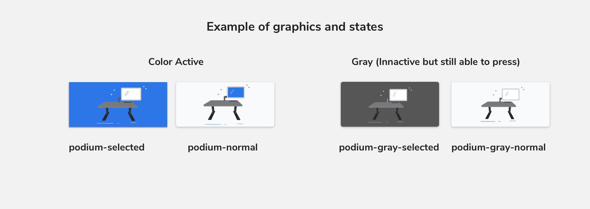
These are in name-normal and name-selected state, but there are also the gray version: name-gray-normal and name-gray-selected eg.
Naming will match content on pages. Download all assetes from the setup-graphics.zip
The button will use the same specs as .setup-button in normal state, except is a circle.
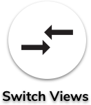
Download all individual assetes from the switch.zip
There is an animation that happens with this button is pressed the color background that it changes to is background-color:#2D76E8
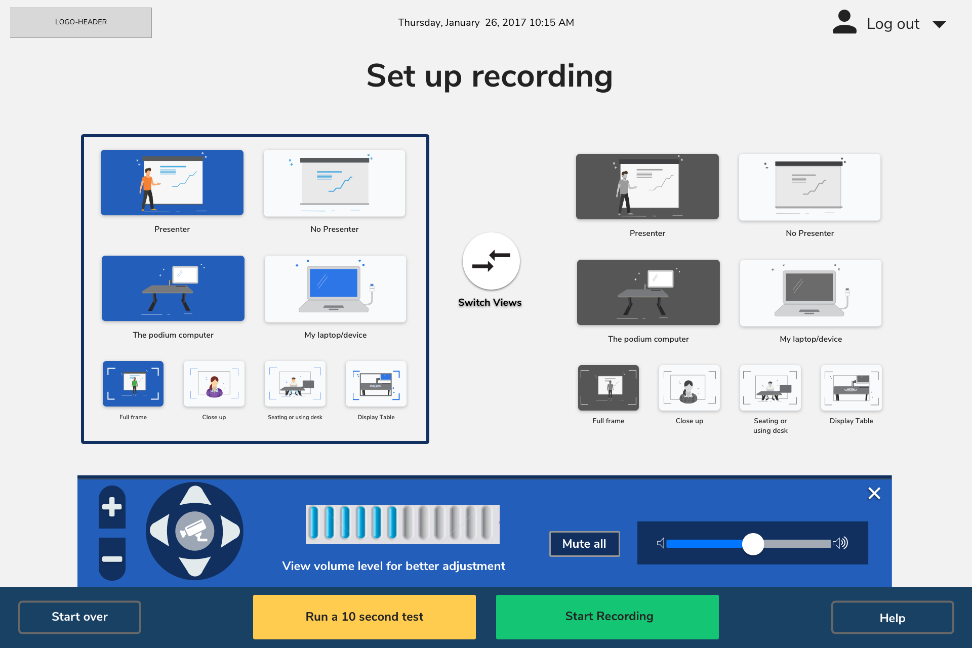
The button will use .setup-button in normal state. It has text using H4 Adjust camera and volume
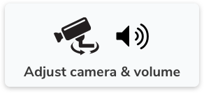
assets needed are 2 icons in one png for easier use


The arrows have a shadow of box-shadow: 0 2px 7px rgba(0, 0, 0, .5); in normal state. For press remove the shadow so it appears to be "pressed"
Download all individual assetes from the camera-control.zip

The background is background: #113060; border-radius: 44px 44px 0 0; in normal state. For press change the background color to background: #9E9DA2; so it appears to be "pressed"
Download all individual assetes from the zoom-control.zip
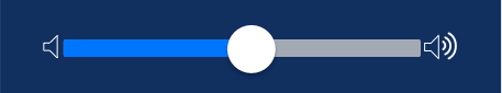
The volume has a background color #112F60 for interaction please view: Volume UI Example from the UI elements section"
Download all individual assetes from the volume-control.zip